Building Four New Themes for Omeka S and Omeka Classic
I work with Omeka a lot, and there's one problem I keep running into. Omeka is great at the serious work of a digital collection: metadata, files, exhibits. But making the public site look like it belongs to your library, museum or archive usually means accepting a stock theme, maintaining your own CSS and template edits through every update, or paying a developer for something that's hard to change later.
I wanted a better answer, so about a month ago I started on a theme. My plan was one very flexible theme with presets for different kinds of collections. That's not quite how it went. A month later I have four themes running on both Omeka S and Omeka Classic, plus a live customizer called Design Studio and a set of page blocks called Block Suite.
How one theme turned into four
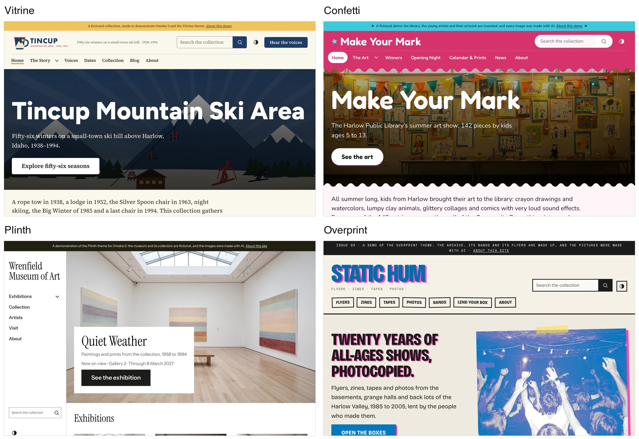
Vitrine came first, and it ended up with more than 70 settings. But presets and settings can only take you so far. A gallery wall and a photocopied zine need different layouts as well as different colors, and cramming all of that into one theme would have meant even more settings for everyone to wade through.
So I pulled everything the themes have in common into one shared engine and kept each theme's own design on top of it. That decision made the rest possible. I can fix a bug or add a feature once and it reaches every theme, while each theme still gets to look like itself.
Vitrine: the adaptable one
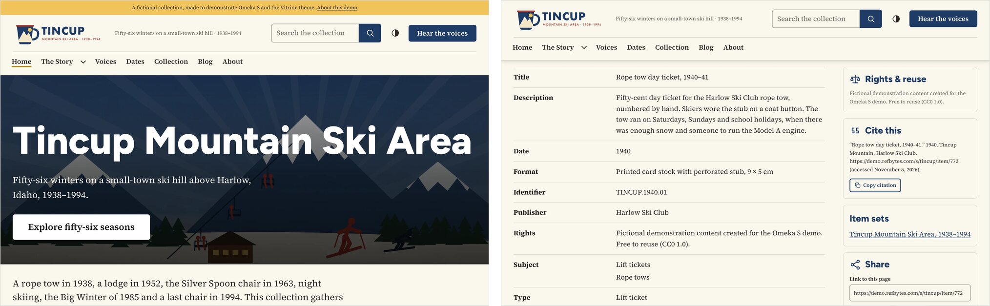
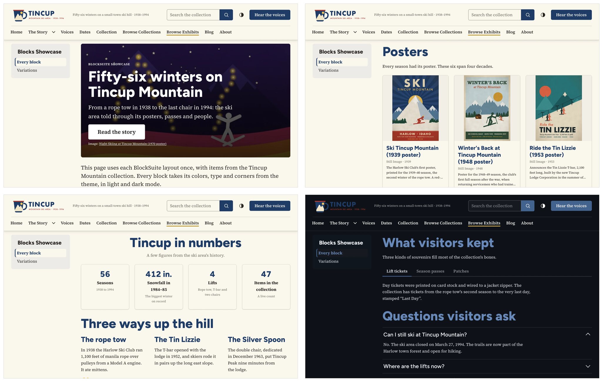
Vitrine is still where I'd send most collections first. It has eight presets, nine included fonts and four header layouts. To show it off, I made up a small-town ski hill in Idaho and gave it fifty-six winters of posters, lift tickets and oral histories.
DEMO SITE: Tincup Mountain Ski Area
Confetti: the friendly one
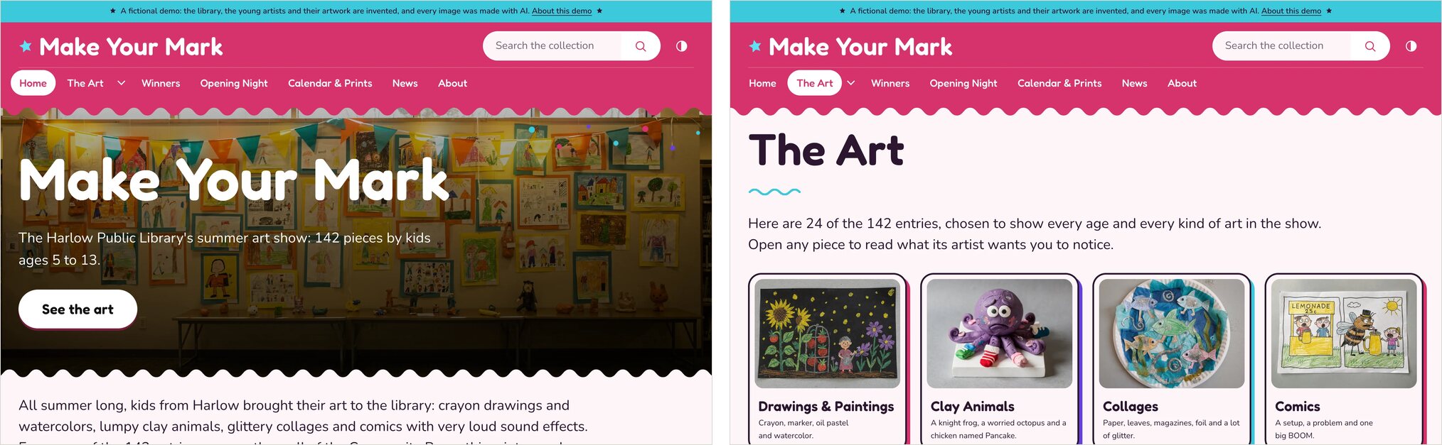
Confetti is for children's collections, school projects and family programs, with bright palettes, wavy edges and sticker-style cards. It also taught me a few lessons. I tried to keep its settings list short, then missed Vitrine's header options almost immediately and added them back. My first pass at Block Suite's tabs drew odd half-ovals along the tab line. And when I built the demo, every kid's drawing was labeled "Still Image" under its title, which isn't very friendly, so I added a setting for that line.
DEMO SITE: Make Your Mark
Plinth: the gallery wall
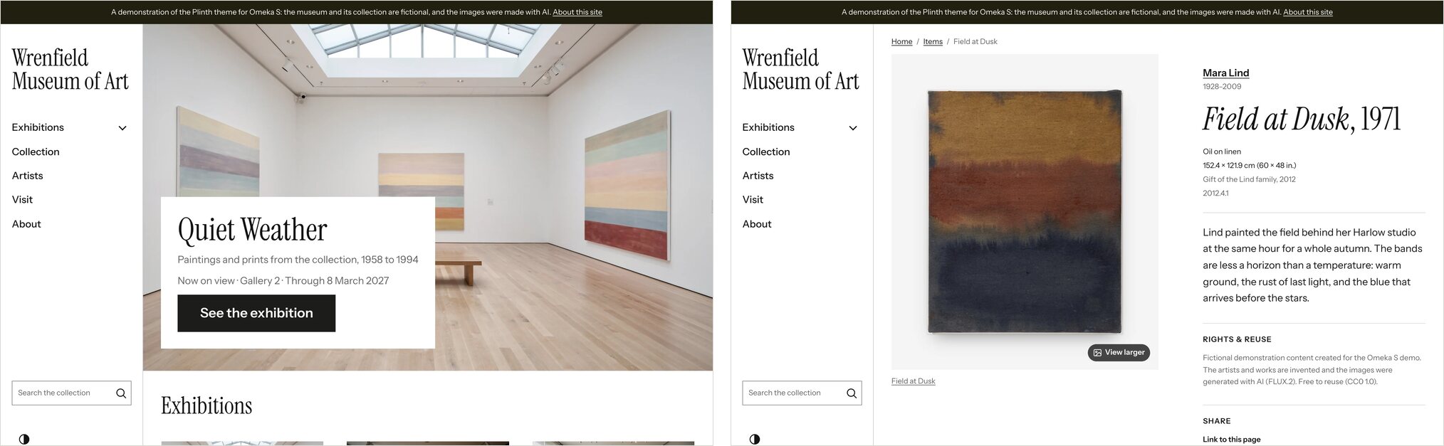
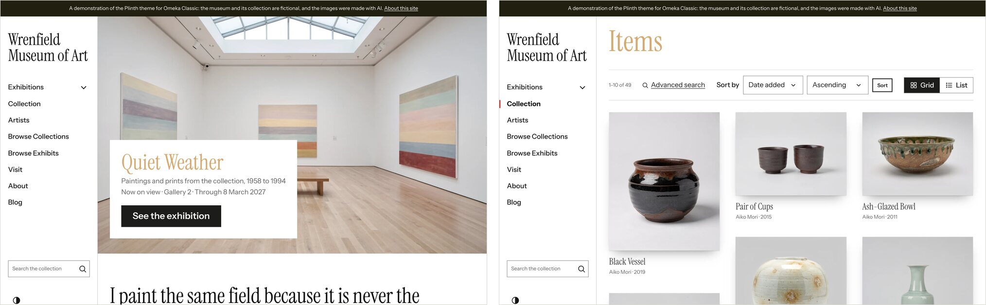
Plinth is for art museums, galleries and artist estates. I didn't want it to be a reskin, so it has its own layouts: a menu in a side rail, works shown whole at their own shape, and a museum-style wall label beside each one. You choose how works are hung, with a soft shadow, a mat or a frame.
Its first bug showed up as soon as I added artist portraits to the demo: the layout hid the artist's name. I fixed that the same day. The portraits were AI-generated, and one came back with a pineapple sitting on the printing press, so that one got redone too.
DEMO SITE: Wrenfield Museum of Art
Overprint: the two-ink zine
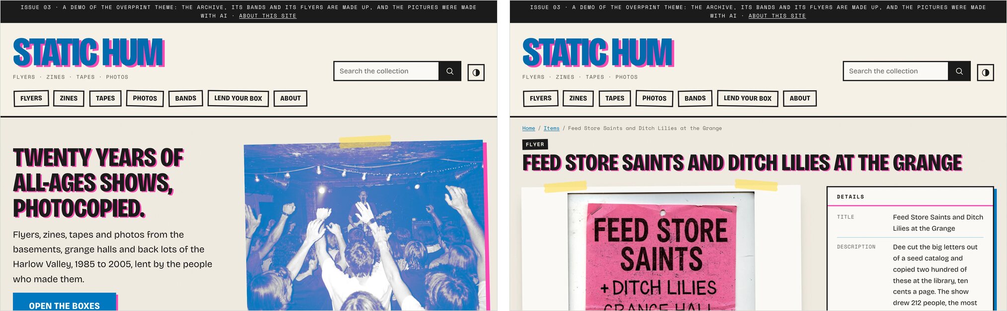
Overprint is for community archives, zine libraries and any collection that was photocopied before it was preserved. It started as a mockup called Riso, after the printing process, but RISO is a trademark, so it became Overprint. Titles and pictures print in two inks that never quite line up, cards are taped to the page, and each one gets a sticker showing what it is: flyer, zine, cassette, photograph.
Making photos look like a two-color print run with nothing but CSS took some of the fiddliest code in the project. I like how far you can push it, too. The same theme can look like a gig poster or a calm newsletter.
DEMO SITE: Static Hum
Bringing them to Omeka Classic
I host both Omeka S and Omeka Classic sites, and a lot of great collections still run on Classic, so I wanted the themes there too. The colors, type and overall design carried over from the Omeka S engine, but every page template had to be rebuilt for Classic, with Exhibit Builder and Simple Pages in place of Omeka S's page blocks. I also styled popular plugins like Geolocation, Commenting and Contribution, because a theme isn't much use if the plugins people rely on look broken in it.
DEMO SITE: Wrenfield Museum of Art on Omeka Classic
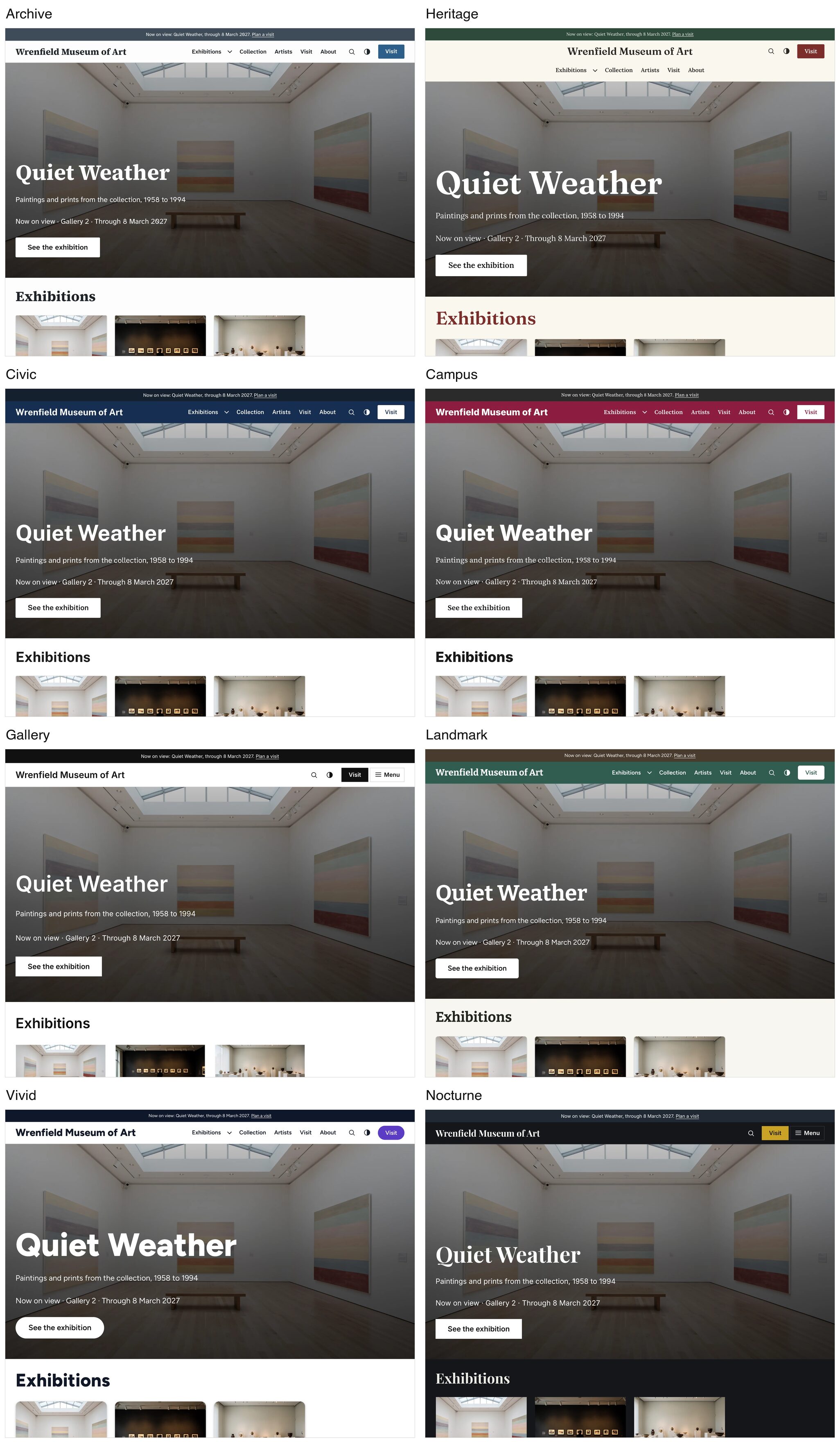
One collection, eight presets
Presets are still the fastest way to see what a theme can do. Here's the same museum home page in each of Vitrine's eight presets. The content is identical. Only the preset changed, and it takes care of colors, fonts, header layout, buttons and corners together.
How far can you push it?
A preset is only a starting point, and anything you set yourself sticks even if you switch presets later. I wanted to see how far that goes, so I took the same museum and changed about fifteen settings for each of these looks. No CSS, no template edits.
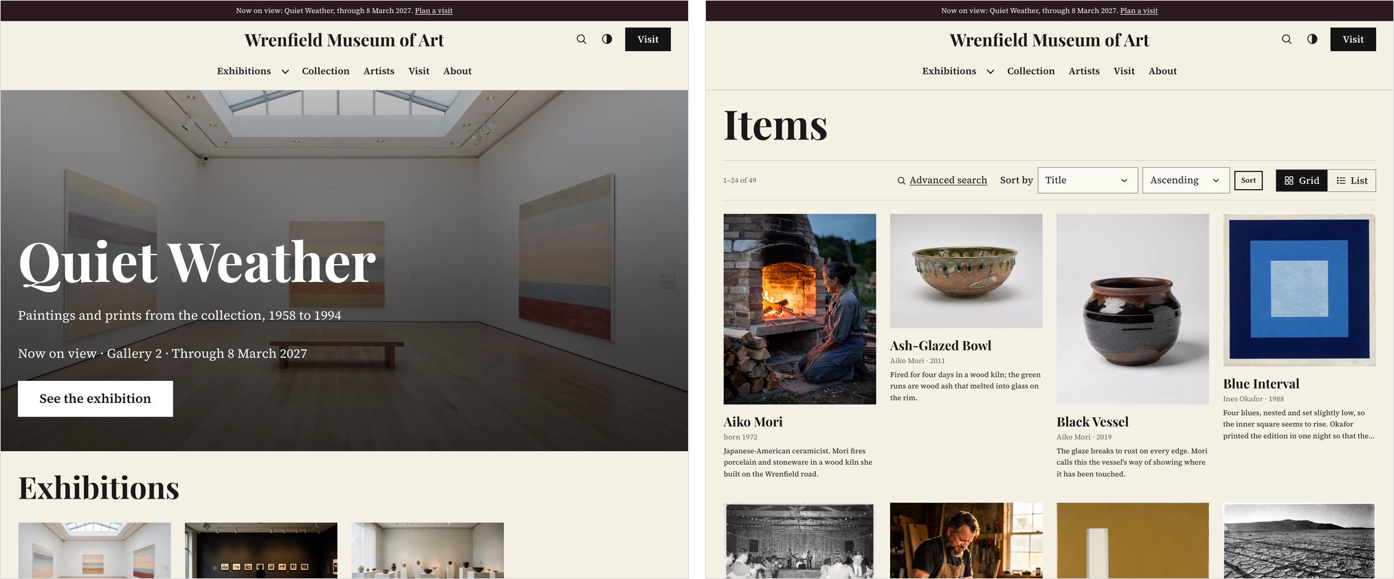
The newspaper. Starting from Archive: cream paper, black ink and a red accent, Playfair Display headlines over Source Serif text, a centered header, square corners, no shadows, and unframed cards that show each work at its original proportions.
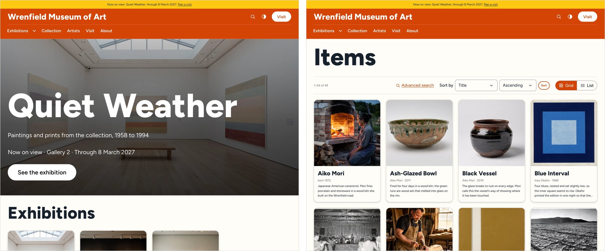
The community center. Starting from Vivid: burnt orange, navy and yellow, big heavy Figtree headings, a menu below the site name, pill-shaped buttons, very rounded corners and square card images.
The university collection. Starting from Campus: navy and gold, Source Serif headlines over Public Sans text, a gold announcement bar and tidy framed cards with wide images.
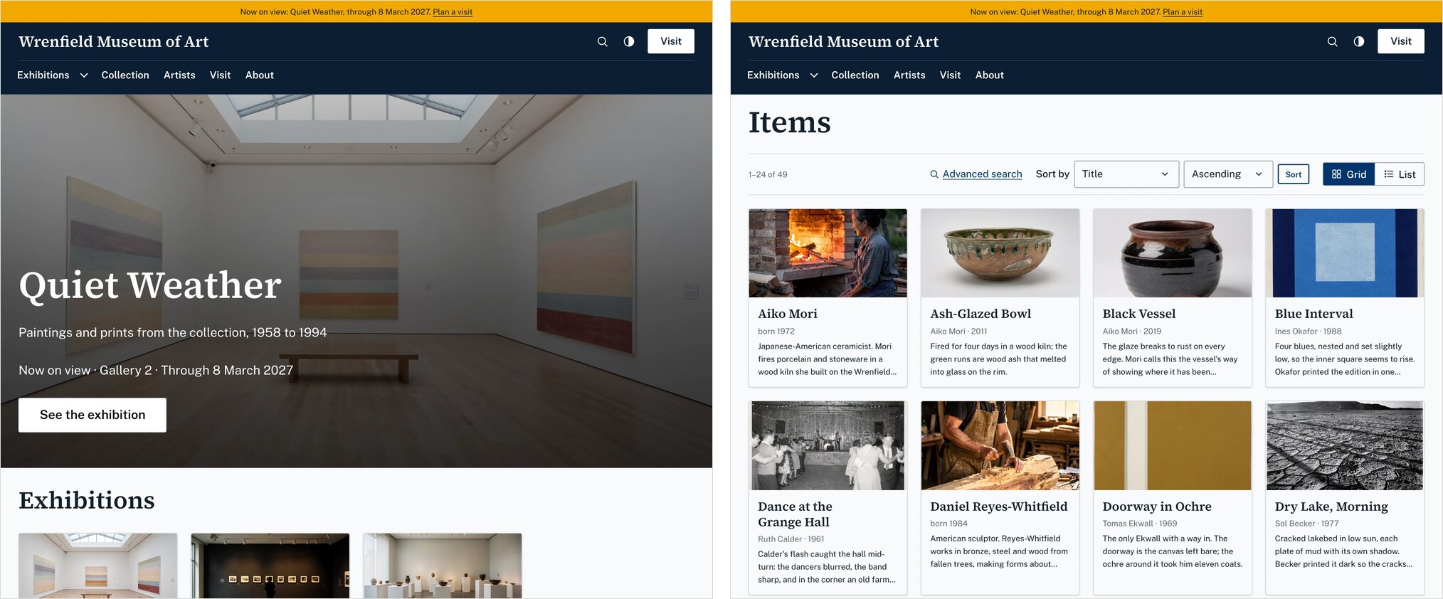
The night gallery. Starting from Nocturne: always dark, with a deep teal background, mint and white in Inter, and card titles placed right over the artwork.
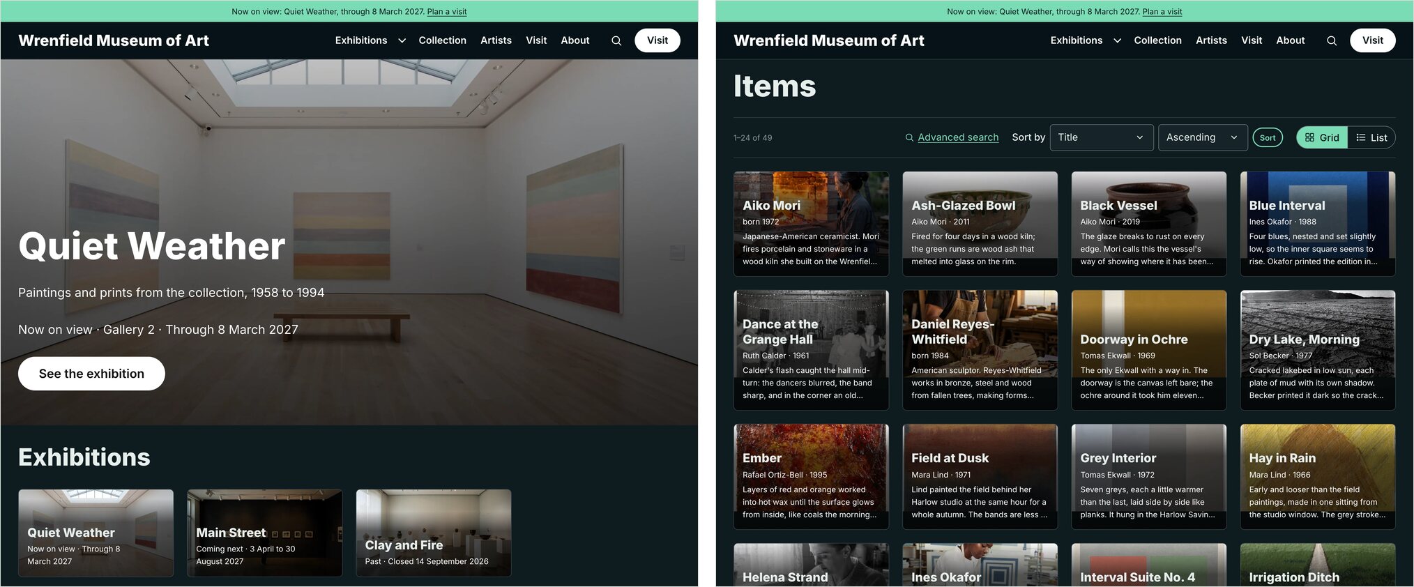
Four very different sites, one theme, one collection. This is the result I was hoping for when I started.
The work that doesn't show up in a screenshot
Readable colors were harder than I expected. I wanted you to be able to type in any brand color and have the text stay readable, in light and dark. An early version looked fine until I checked the numbers: dark mode links in the Gallery preset only reached 3.96:1 on certain panels, short of the 4.5:1 that accessibility guidelines ask for. So I built a test suite that now runs 43,920 contrast checks on Vitrine alone. Screenshots weren't enough either. Checking the text on rendered pages found failures I hadn't spotted by eye, and some of them were in my own modules, which had colors hard-coded for light backgrounds. I'm still finding edge cases, including one while taking screenshots for this post.
Other people's modules matter too. Real sites don't run a theme by itself. So I ranked the 201 modules in the Omeka S directory by downloads, installed the ten most popular ones with public pages, and tested them in all four themes, in light mode, dark mode and on phones. The first run found 264 contrast failures and eight pages that overflowed the screen. After the fixes, nothing overflows and contrast failures are down to 112, with what's left coming from the modules themselves.
The rest of the list is less dramatic, but it's the stuff that eats up time on a real project, so I wanted it handled in all four themes:
- Dark mode. Every theme builds a dark version from your colors. It can follow each visitor's device, offer a switch, stay dark all the time or be turned off.
- Item pages. You get an accessible image viewer, one-click citations, sharing, previous and next links through a collection, and rights statements in plain language.
- Accessibility. The themes are designed to meet WCAG 2.2 AA, with visible keyboard focus, reduced motion support and pages that reflow cleanly on small screens.
- Fonts. The web fonts are included and served from your own site, with no requests to Google.
Design Studio: seeing it before you publish it
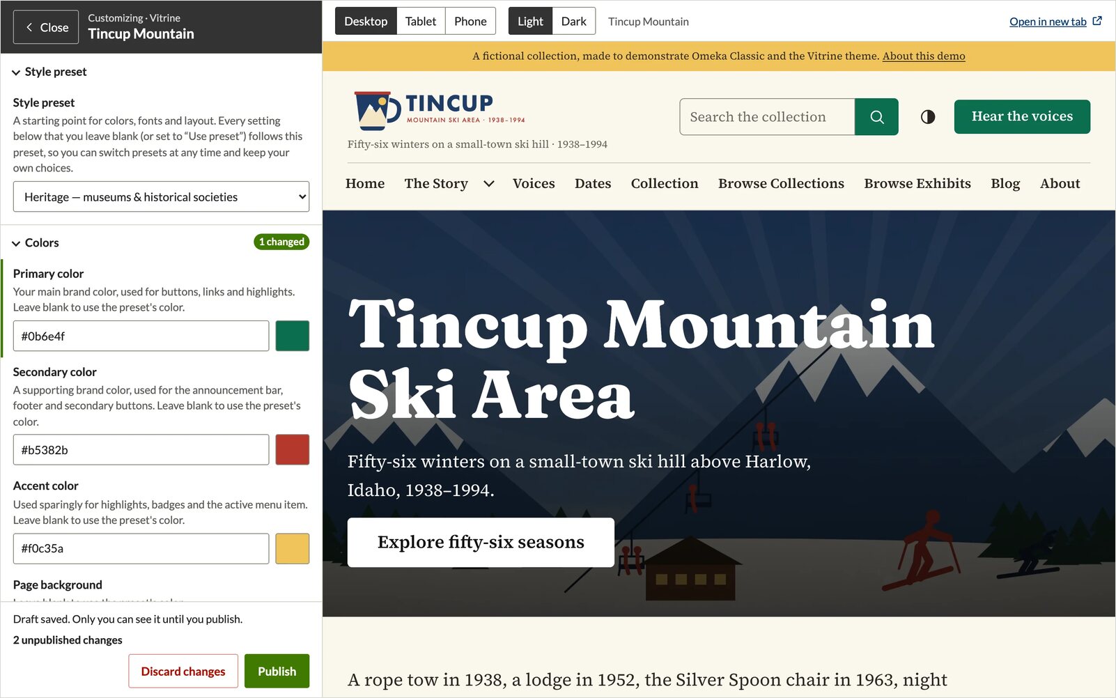
Seventy-plus settings aren't much use if every change means editing a form, saving, switching tabs and refreshing. So right after Vitrine, I built a companion that puts your theme's settings in a panel beside a live preview of your own site. Pick a color or font and the page changes as you go. You can follow links in the preview to check item pages and search results, and flip between desktop, tablet and phone, or light and dark.
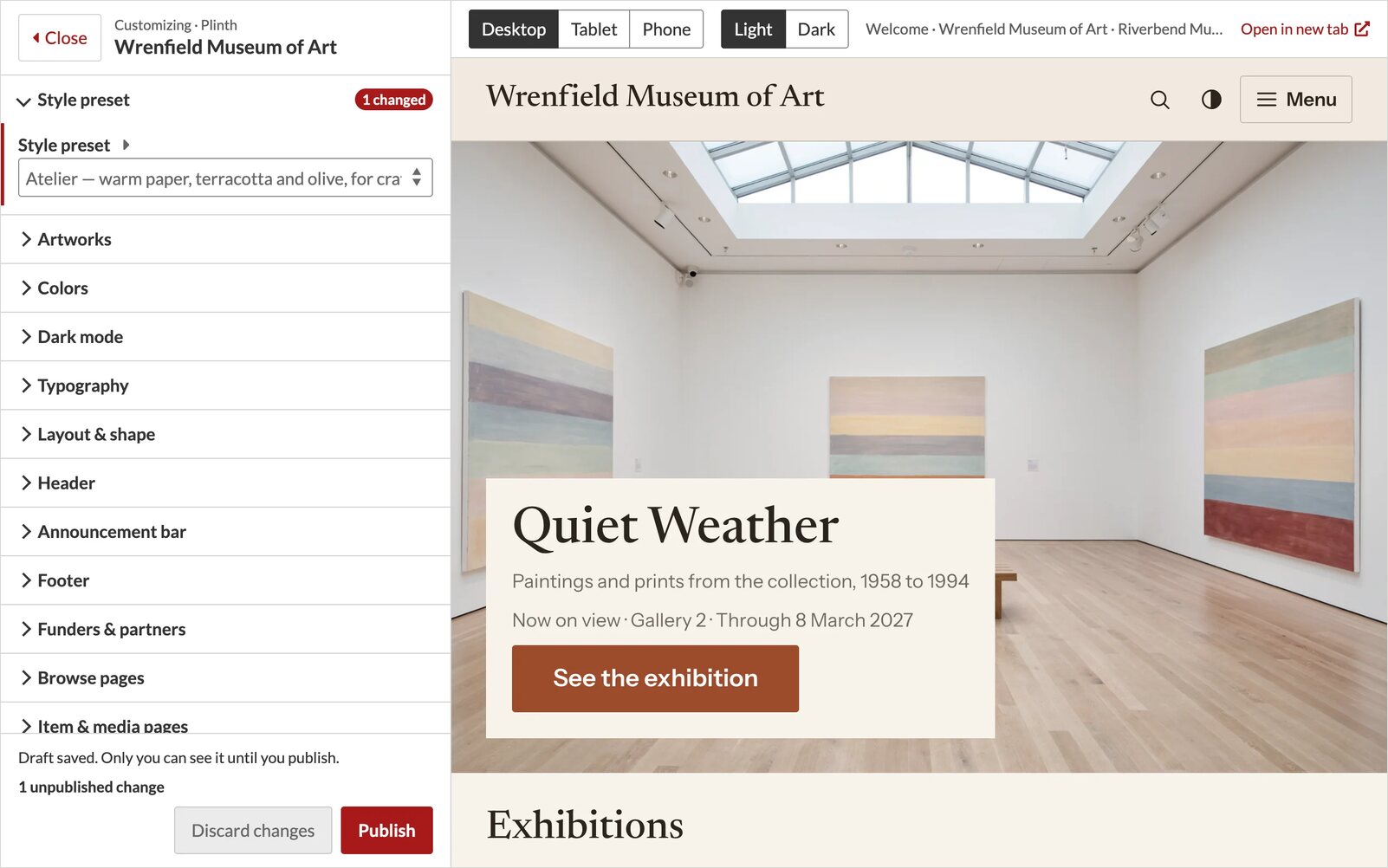
The part that mattered most to me was drafts. Visitors keep seeing the published site until you click Publish, and other staff don't see your draft either. My first version kept drafts in the login session, and then I discovered that logging out wiped them. Moving them to the user's account fixed that, and it means you can pick up a draft from another computer.
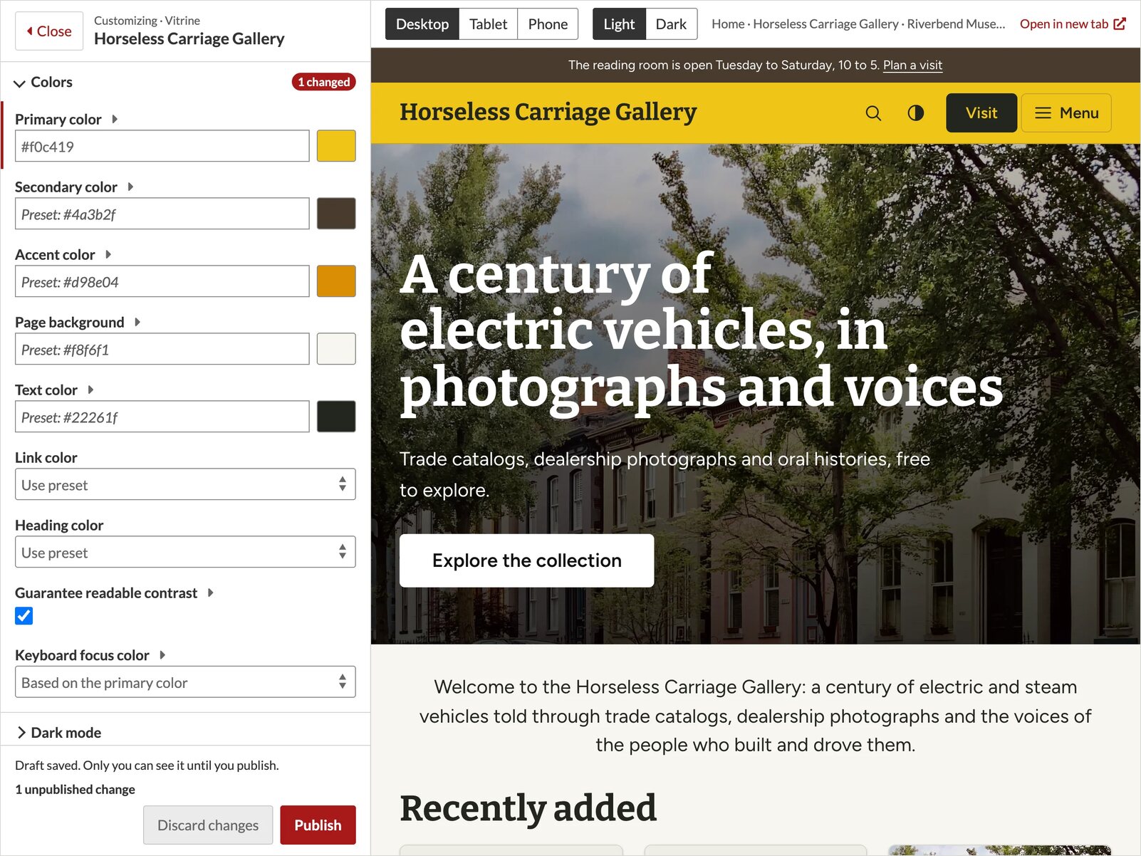
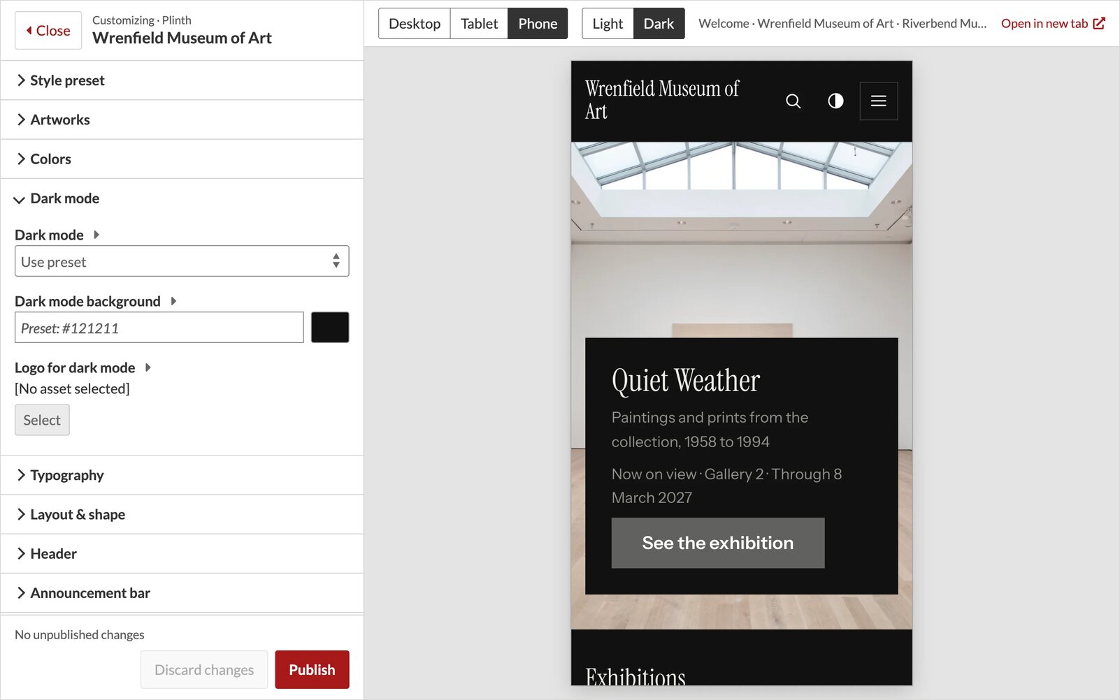
It started out as Vitrine Studio. Once there were more themes it got a new name, and now it works with all four, on both Omeka S and Omeka Classic. It's also optional: every theme works fine with Omeka's regular theme settings page.
Block Suite: filling in the missing blocks
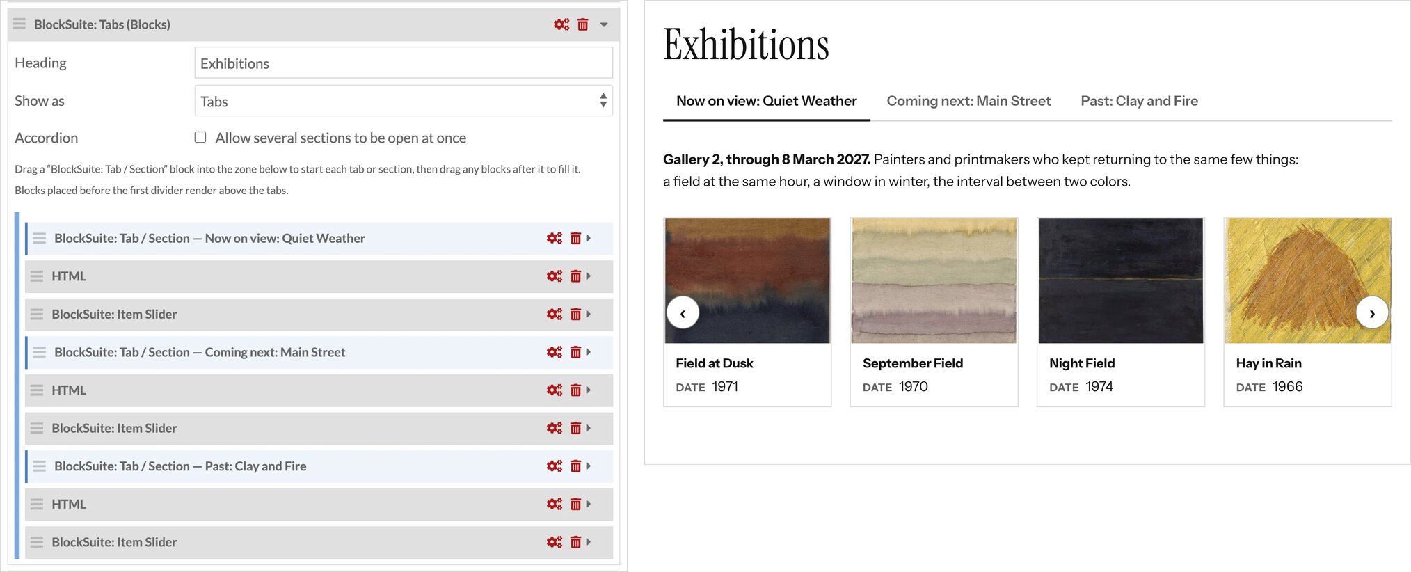
Omeka's page tools cover the basics, but as soon as you want a hero banner, key figures, a timeline or tabs, you're usually hand-writing HTML and hoping it survives the next edit. Block Suite actually predates the themes, starting with sliders and tabs, but building Vitrine showed me how much was still missing. Now those are regular blocks you fill in through the normal editor, and they pick up your theme's colors and fonts, so they change when your design does.
On Omeka S, the addition I'm most pleased with is the containers. Columns and Tabs can hold any other blocks, so a tab can contain text, a slider, a browse preview or even another set of columns.
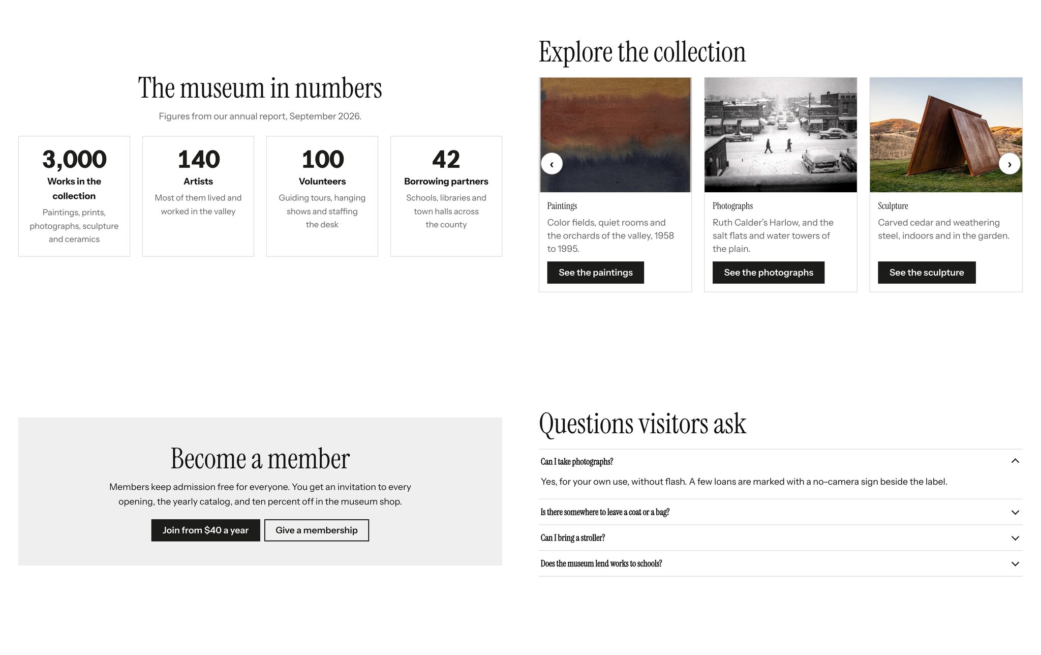
It hasn't been bug-free. In version 1.2, a page with several blocks of the same type could lose their settings on save, which is exactly the kind of bug you don't want in a page editor. That's fixed now. You can see two of the blocks live on the Make Your Mark demo: statistics on the home page and a timeline on the Opening Night page.
Classic needed a different approach. Exhibit Builder comes with five page layouts, so Block Suite adds sixteen more there, including a hero, pull quote, item cards, spotlight, logo wall, tabs and timeline, with shortcodes for Simple Pages and the home page. Classic also had a surprise waiting: its HTML filter only knows HTML 4, so it strips newer elements like figures and navigation when you save. Block Suite teaches it about them, and I still had to ship 1.0.1 right after 1.0.0 because saving was removing a few more things I'd missed.
Click around
The best way to judge a theme is to click around in it. The demo collections are all fictional, and they're all set in and around the same made-up town of Harlow, Idaho.
- Vitrine on Omeka S: Tincup Mountain Ski Area
- Confetti on Omeka S: Make Your Mark
- Plinth on Omeka S: Wrenfield Museum of Art
- Overprint on Omeka S: Static Hum
- Plinth on Omeka Classic: Wrenfield Museum of Art
Full disclosure: I run Omeka hosting at RefBytes, and these themes and modules are included with those plans, so I have a stake in them. If you want to see how they work, there are docs for each one.
If you build something with them, I'd love to see it.