Bring Your Collections to Life with Interactive Visualizations
One of the things I kept running into while working with Omeka S was how hard it was to get a bird's-eye view of a collection. You could browse items, run searches, and read metadata — but actually seeing patterns across thousands of records meant exporting to a spreadsheet, cleaning data, and wiring something up in a separate tool. I wanted to fix that.
So I built the Data Visualization Builder: a module that connects directly to your Omeka S items and metadata to generate live, interactive visualizations. Configure a chart once, and it stays current as your collection grows. No exports, no third-party tools, no code.
What You Can Build
I wanted to support the kinds of questions archivists and researchers actually ask, so the module includes several visualization types:
Bar and Line Charts — Compare values across categories or track change over time. How many items belong to each subject? Which decade has the most photographs?
Pie and Donut Charts — Show proportions at a glance. Useful for breakdowns like media type, language, or geographic origin.
Timelines — Plot items by date to surface how a collection spans history. Group by year or month to see periods of activity or absence.
Maps — If your items have geographic coordinates, you can plot them on an interactive map. When items cluster together the map groups them automatically, so the display stays readable at any zoom level.
Treemaps — Visualize hierarchical data as nested rectangles, great for showing how a large collection breaks down by category and subcategory.
Choropleth Maps — Shade regions of a world map by value to show geographic distributions across countries or regions.
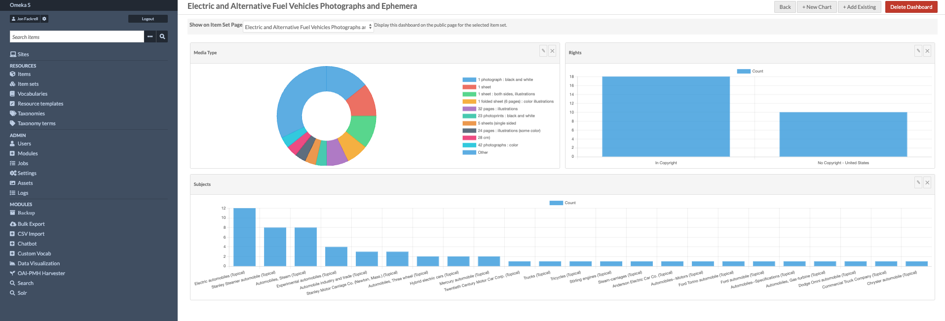
How Dashboards Work
Visualizations live inside dashboards — pages that hold multiple charts in a flexible, drag-and-resize grid. Building one was something I put a lot of thought into, because I wanted the experience to feel fast and intuitive.
Here's how it works:
- Go to Data Visualization in the admin menu and click Add Dashboard.
- Click Add Chart — a panel slides in alongside a placeholder in the grid.
- Choose a chart type, pick the metadata property you want to visualize, and optionally filter by item set.
- A live preview updates in the grid as you configure — you see exactly what it will look like before you save anything.
- Save the chart, then drag and resize the widgets to arrange your dashboard.
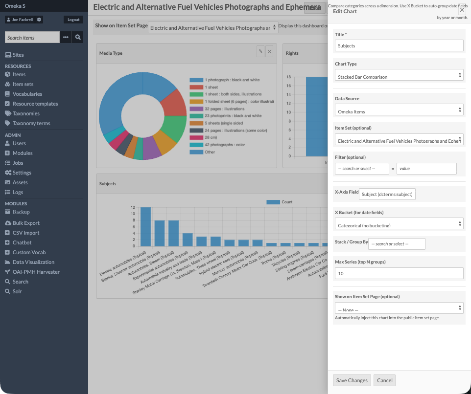
The live preview was one of the pieces I'm most happy with. It makes experimenting feel low-stakes.
Embedding on Your Site
Any chart can be embedded on a public site page using the Data Chart page block — just pick the chart and it appears for visitors, interactive and always showing current data. Charts also show up automatically on item set pages, so visitors browsing a particular collection get relevant visualizations in context.
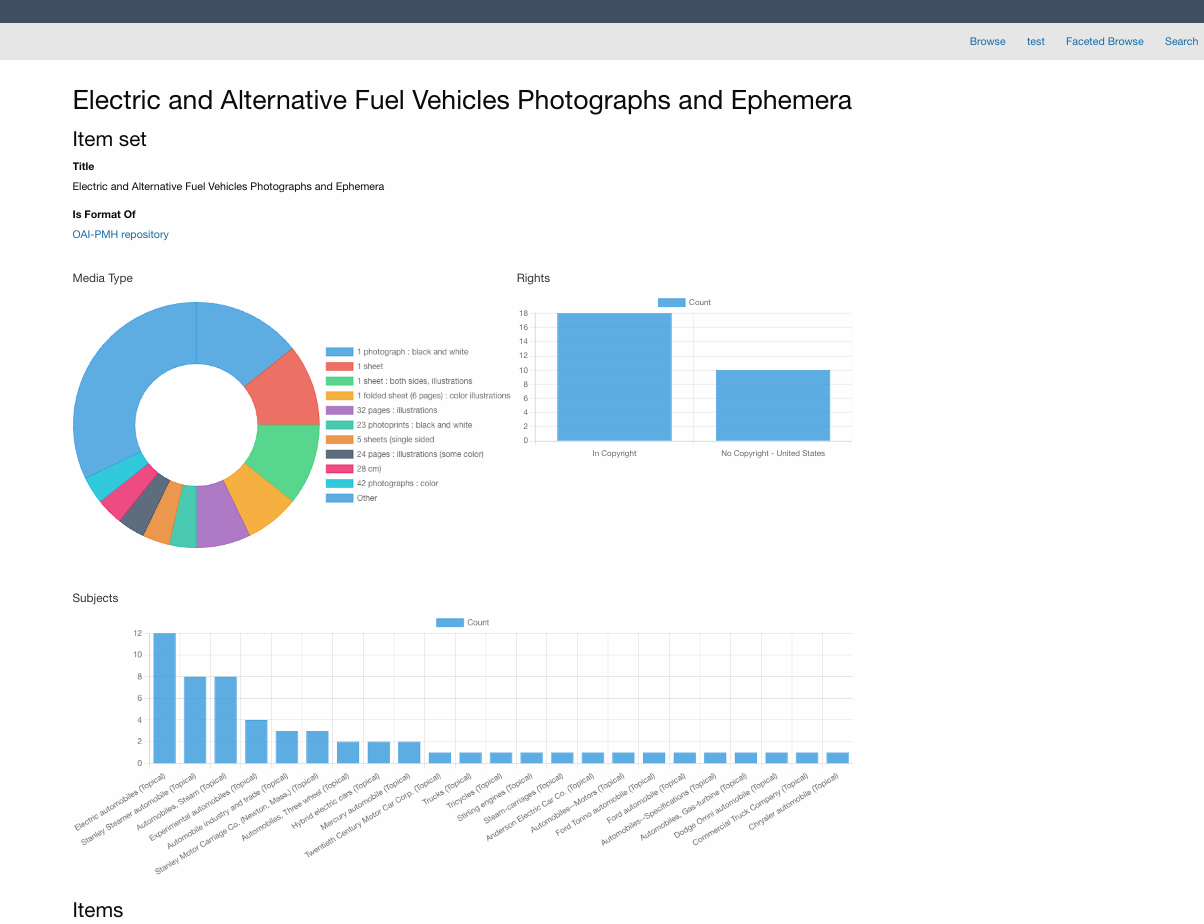
Some Examples of What's Possible
- A bar chart of dcterms:subject values showing the most common topics across a photograph collection
- A timeline of newspaper issues grouped by publication year
- A map plotting manuscript origins using coordinates stored in item metadata
- A pie chart breaking down media types — image, video, document, audio — across a full archive
- A treemap showing how a natural history collection breaks down by kingdom, class, and order
Try It
The module is available in the Modules section of your Omeka S admin. After installing, the Data Visualization link appears in the left-hand admin navigation. Start by creating a dashboard and adding a chart — the live preview makes it easy to explore what your data looks like before committing to anything.
I built this as part of my ongoing work extending Omeka S, and it's one of the projects I'm most proud of. If you have questions or run into anything unexpected, feel free to reach out.